In today’s fast-paced digital landscape, designing forms that capture user interest and drive high completion rates is essential for collecting valuable, actionable data. Whether you’re a marketer, UX designer, business owner, or researcher, creating user-friendly forms that are clear, engaging, and easy to complete can significantly improve response rates, ensuring you collect meaningful information.
This guide offers practical tips on how to design forms that encourage users to follow through, with strategies focused on layout, question structure, and tone.
1. Keep the Layout Simple and Intuitive
A clear, uncluttered layout is the foundation of a high-converting form. Users need to feel guided and comfortable, not overwhelmed. Here’s how to optimize your form’s layout for ease of use:
- Focus on a Clean Design: A minimalistic approach with plenty of white space helps keep the user’s focus on one question at a time, reducing distractions and making the process feel manageable.
- Organize Fields Logically: Group related questions together to establish a logical flow. This reduces user frustration, as they won’t have to jump around to fill out sections.
- Use Progress Indicators: For longer forms, add progress indicators or section markers. This gives users a sense of how much is left, which can reduce drop-off rates by helping them see an end in sight.
2. Prioritize Mobile Responsiveness
With many users filling out forms on their smartphones, ensuring your form is mobile-friendly is critical:
- Optimize for All Devices: Your form should work seamlessly on smartphones, tablets, and desktops. A mobile-responsive design adapts to any screen size, making the form easy to navigate.
- Simplify Input Fields for Mobile Users: Mobile users benefit from dropdown menus and checkboxes rather than text-heavy input fields. Reducing the need for typing improves the user experience on smaller screens.
- Test Across Devices: Preview and test your form on multiple devices to catch any design or functionality issues that might impact user engagement.
3. Structure Questions for Clarity and Engagement
The way questions are organized and phrased can greatly affect how users interact with your form:
- Ask the Most Important Questions First: Start with essential questions to capture key information right away, even if users don’t finish the entire form.
- Use Clear, Direct Language: Avoid technical jargon and overly complex terms. Instead, keep questions concise and straightforward to avoid user confusion.
- Limit the Number of Questions: Each additional question adds friction to the form completion process. Only ask for information that’s truly necessary, as lengthy forms often lead to higher abandonment rates.
4. Select the Right Field Types for Each Question
Using the correct field types for each question can make the form faster and easier to complete:
- Use Multiple Choice for Easy Answers: Dropdowns or multiple-choice fields are easier for users to select and don’t require typing, which improves response rates.
- Consider Short and Long Text Fields Carefully: Use short text fields for quick answers and reserve long text fields for questions that require detailed responses, as too many open-text fields can overwhelm users.
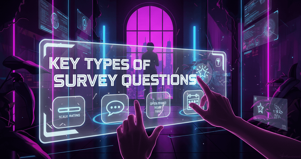
- Incorporate Interactive Field Types: Add rating scales, sliders, or checkboxes to make the form more engaging and interactive, allowing users to respond quickly while keeping their attention.
5. Use a Conversational Tone
A friendly, conversational tone can make forms feel more approachable, increasing the likelihood that users will complete them:
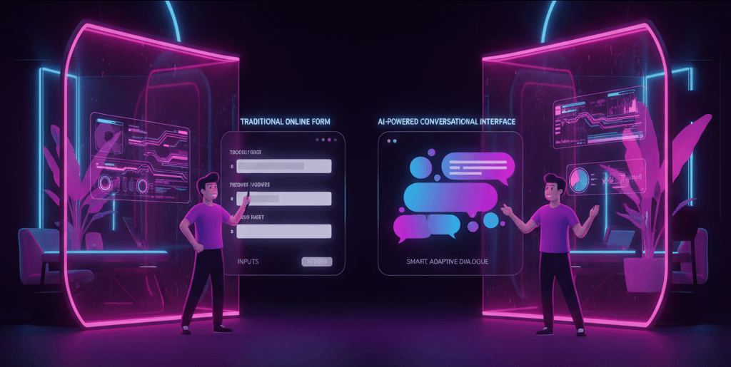
- Personalize the Form Language: Use conversational language to make the form feel more human and less formal, encouraging users to share their information freely.
- Use Encouraging Microcopy: Place friendly instructions or prompts, like “Just a few more questions,” to reassure users and make them feel at ease.
- Address Users Directly: Use “you” and “your” to create a personal experience, making users feel like the form is tailored just for them.
6. Leverage Conditional Logic for a Dynamic Experience
Conditional logic allows you to display relevant questions based on previous responses, creating a more personalized form experience:
- Show Only Relevant Questions: Use conditional logic to show follow-up questions based on previous answers, keeping the form relevant and specific to each user.
- Avoid Unnecessary Questions: Hide questions that don’t apply to certain users, reducing completion time and making the form feel tailored, which enhances the user experience and completion rates.
7. Add Clear Calls to Action
Strong calls to action (CTAs) guide users to complete the form and confirm their entries. A good CTA is simple, visible, and action-oriented:
- Use Action-Oriented Language: Phrasing like “Get Started” or “Submit My Response” encourages users to take the next step and complete the form.
- Keep CTAs Consistent and Visible: Make sure the submit button stands out and is easy to find, so users don’t waste time searching for it.
- Provide Confirmation: Add a thank-you or confirmation message upon submission. This reassures users that their responses have been received and appreciated, creating a positive end to their experience.
8. Offer Incentives Where Appropriate
Offering a small incentive can be a powerful motivator for form completion:
- Provide a Reward for Completion: If relevant, consider offering incentives like discounts or entry into a giveaway to motivate users to finish the form.
- Clearly Communicate the Incentive: Let users know exactly what they’ll receive upon completing the form and ensure the reward is easy to access or redeem.
- Be Transparent About Value: If the form leads to a downloadable resource or guide, communicate its value upfront to encourage users to follow through.
Real-World Examples of High-Converting Forms
High-converting forms share certain features, such as a conversational tone, progress indicators, and well-placed CTAs. Here are a few examples:
- Lead Generation in SaaS: SaaS companies often use forms that prioritize essential fields upfront and utilize conditional logic to customize follow-up questions, reducing form length and making them feel personalized.
- Customer Feedback Surveys in E-commerce: E-commerce businesses often use progress indicators and a conversational tone in feedback surveys to maintain user engagement and encourage completion.
- Appointment Booking in Healthcare: Forms for scheduling appointments use clear, direct language with mobile-optimized fields to ensure ease of completion on any device.
These examples highlight the importance of creating intuitive layouts, structuring questions logically, and using incentives to increase completion rates.
Zinq AI as a Solution for High-Converting Forms
Zinq AI’s form-building tools offer everything you need to create forms optimized for high response rates. With features like mobile-responsive design, conditional logic, and a variety of interactive field types, Zinq AI makes it simple to build engaging, user-friendly forms that convert. Here’s how Zinq AI can support your goals:
- Customizable Tone and Language: Easily personalize form language to fit your brand voice and engage users in a conversational manner.
- Dynamic Conditional Logic: Set up tailored follow-up questions based on previous responses, creating a smooth, relevant experience for each user.
- Mobile Optimization and Testing: Zinq AI’s forms are designed to perform well across devices, ensuring accessibility for all users.
With Zinq AI, designing forms that boost engagement, increase response quality, and maximize completion rates is simple and effective.


