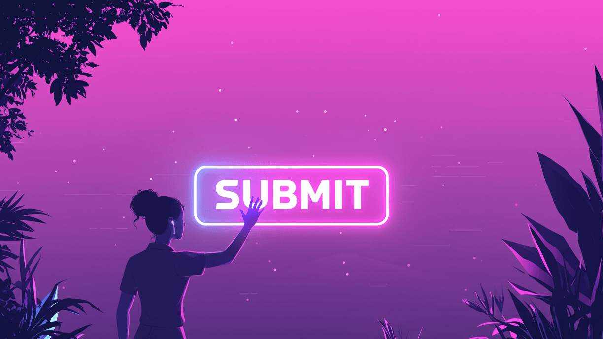
Let’s be honest. Have you ever thought, “Wow, I can’t wait to fill out this online form!”? Probably not. Forms are the hard workers of the internet, but they don’t get much love. We use them to sign up, buy things, and get in touch. For most of us, they feel like a chore. They are like digital paperwork we just have to finish.
But some forms are easy. You fly through them and click “submit” without thinking. Others are so frustrating that you just close the tab. You might even forget why you needed that thing in the first place. What makes them so different? It’s not magic. It’s psychology.
The secret to great online form design is knowing the simple mental cues that guide a user. It’s about turning a boring job into a smooth, easy experience. Today, we’ll show you the psychology of form design. You’ll learn how to make forms that people actually want to complete. Let’s dive in.
So, Why Do We All Secretly Hate Filling Out Forms?
That bad feeling you get from a long, complex form isn’t just you being lazy. Your brain is trying to protect you from two things it hates: extra work and too many choices. This brings us to a few key ideas that are important for form optimization.
The Brain Drain: What is ‘Cognitive Load’ Anyway?
Think of your brain’s working memory like the RAM on your computer. Your computer slows down when too many apps are open, right? The same thing happens to your brain. Cognitive load is just a term for how much mental energy you are using.
A form with a messy layout or confusing questions increases the cognitive load. Users have to think harder to know what you’re asking for.
Here are a few common causes of high cognitive load in forms:
- Too many fields on one page: It looks like a mountain to climb.
- Unclear labels or instructions: “What do they mean by ‘Address Line 2’?”
- Poor formatting: Phone number fields that don’t accept spaces or dashes.
- Multi-column layouts: Your eyes don’t know where to go next.
The higher the cognitive load, the more likely a user will get frustrated and leave. Your goal is to make your form so simple and easy to use that it takes almost no thought. This is a key part of user-friendly form design.
Decision Fatigue: The ‘I Can’t Even’ of Form Fields
Have you ever scrolled through Netflix for so long that you just give up? That’s decision fatigue. We only have a limited amount of mental energy for making choices each day. When we run out, we often make bad choices, or no choice at all.
Forms can be full of small choices. Should I use my work or personal email? Do I really need to give them my phone number? Each question drains your mental energy. This is especially true for optional fields. If you ask for too much, users will get tired of making choices. They will leave the form simply because they are tired.
What’s the main point? Every field you add makes it more likely a user will leave. To reduce form abandonment, be very strict. Only ask for information you truly need.
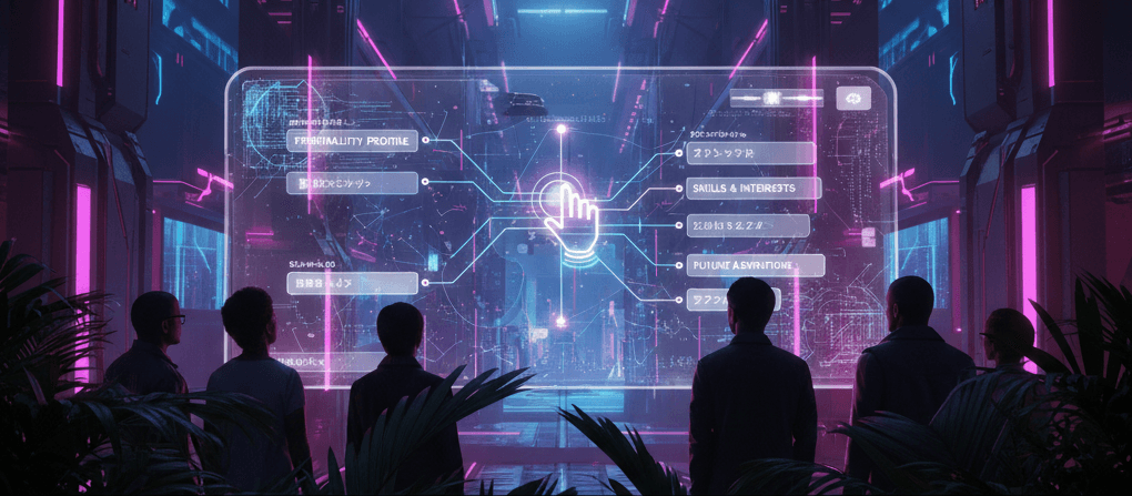
The Smart Psychology That Gets People to Click ‘Submit’
Okay, we know what makes people leave. But what makes them stay? Some powerful psychological principles can greatly increase form submissions. This isn’t about tricking people. It’s about working with how people naturally act to create a better experience.
The Zeigarnik Effect: Why We Need to Finish What We Start
The Zeigarnik (zy-GAR-nick) effect is the human habit of remembering unfinished tasks more than finished ones. Think about a half-finished project at work. It stays in your mind. It’s like a mental itch you need to scratch.
You can use this to your advantage. When someone starts your form, they open a “mental loop.” They then feel a small push to finish it.
How to use it:
- Show a progress bar: Seeing “25% complete” makes users want to get to 100%.
- Break it down: A multi-step form feels less scary. Completing step one makes you mentally committed to finishing step two.
- Start with the easy stuff: Ask for their name and email first. It’s a low-effort way to get them invested before you ask for more complex info.
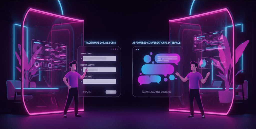
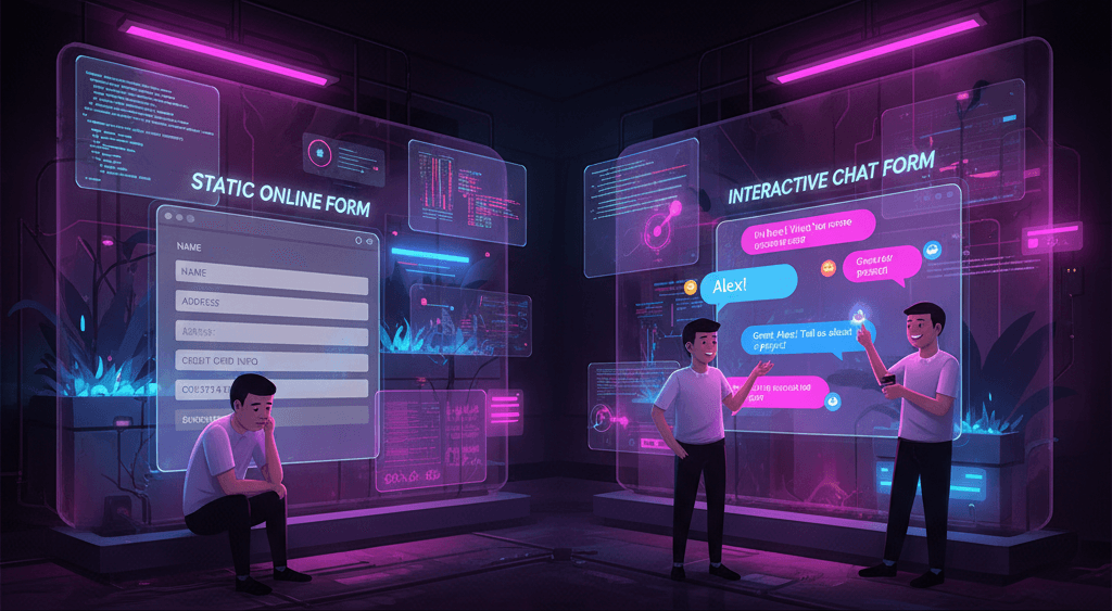
This is a main idea behind tools like ZINQ Forms. They often use a chat-like style that asks one question at a time. This turns a long form into small, easy steps. It keeps pulling the user toward the finish line.
Hick’s Law: Proving Less is Almost Always More
Hick’s Law says that the more choices you have, the longer it takes to decide. More options lead to more time and more frustration.
This idea directly fights decision fatigue. To get a higher form conversion rate, you must simplify. Every field and every dropdown option is a choice. Your job is to get rid of as many choices as you can.
How to use it:
- Remove unneeded fields: Do you really need their fax number in 2024?
- Use conditional logic: Only show relevant questions. If a user says they are “Renting,” don’t show them questions about “Mortgage Details.” For example, ZINQ AI can make forms that change based on user answers. This greatly reduces unneeded choices and improves your customer interaction.
- Use smart defaults: Pre-select the most common option in a dropdown menu.
Social Proof: The Power of ‘Everyone’s Doing It!’
People are social beings. We often look to others to see how we should act. This is especially true when we are not sure what to do. This is called social proof.
Show that other people have filled out your form and were happy. This will make new users feel more safe and sure about doing it too. This is very important for lead generation forms, where trust is a big deal.
How to use it:
- Add a testimonial: A short quote near the CTA like, “This was the easiest signup process ever!” – Jane D.
- Show numbers: “Join over 50,000 subscribers!”
- Include trust badges: Use security logos like Norton or McAfee. You can also add privacy promises like, “We will never share your email.” These can work wonders.
The Principle of Reciprocity: Give a Little, Get a Little Back
The idea of reciprocity is simple. If someone gives you something, you feel a natural push to give something back. For online forms, this means you should give something useful before you ask for information.
Don’t just say, “Sign up for our newsletter.” Instead, offer a real benefit. When users feel they have already received something useful, they are more willing to finish the deal by giving you their details.
How to use it:
- Offer a free resource: “Get our free 50-page ebook! Just enter your email below.”
- Provide a discount: “Sign up and get 15% off your first order.”
- Give a useful tool: “Use our free ROI calculator. We’ll email you the results.”
Fitt’s Law: Making Your Buttons a Joy to Click
Fitt’s Law is a rule for how people use computers. It says the time it takes to move to a target, like a button, depends on the distance to the target and the size of the target. In plain English: big, close buttons are easier and faster to click.
This is very important on mobile devices. Fingers are less exact than a mouse pointer. Don’t make your users make difficult finger movements just to submit the form.
How to use it:
- Make your CTA button big: It should be easy to tap without zooming.
- Use contrasting colors: The button should pop off the page.
- Make sure there’s plenty of empty space: Don’t crowd the button with other things people can click.
Okay, I’m a Believer. How Do I Actually Do This?
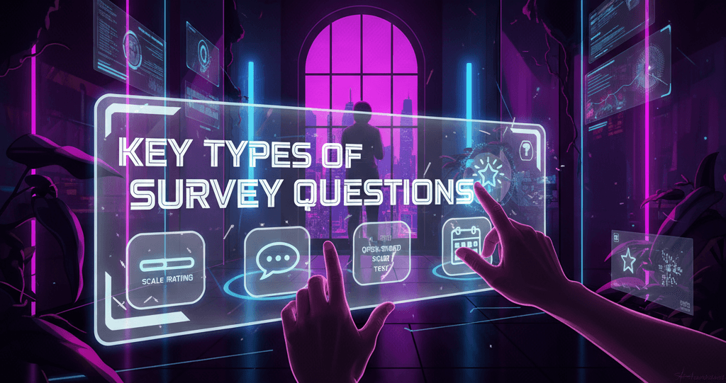
Knowing the theory is one thing. Putting it into practice is another. Let’s look at some useful form design tips and web form best practices you can use right away.
Layouts 101: The Case for a Single-Column Flow
Forget fancy multi-column layouts. Research shows that a single-column layout is fastest for users. Why? It creates a clear, straight path from the start to the submit button. Your eyes don’t have to zigzag. This reduces cognitive load.
Your users should move down the page in one smooth motion. A top-to-bottom flow is easy to follow, simple, and fast.
Smart Labels: Where to Put Text for the Best Clarity
You have a few options for placing field labels (the text that says “First Name” or “Email.”) For most forms, one option is the best choice: top-aligned labels.
Placing the label directly above the input field is best for a few reasons:
- Fastest to scan: Users can see the label and the field in a single glance.
- Mobile-friendly: They work well on small screens without messy text wrapping.
- Clear association: It’s always clear which label belongs to which box.
Placeholder labels (the text inside a box that disappears as you type) might look clean, but they are very hard to use. Users often forget what they were supposed to type!
Your CTA Button: Go Beyond a Boring ‘Submit’
The text on your call-to-action (CTA) button is your last chance to convince the user. “Submit” works, but it’s boring. It suggests the user is giving something up. Instead, write button text that focuses on what the user gets.
A little CTA button psychology can go a long way. Try these alternatives:
- Instead of “Submit,” try “Get My Free Guide.”
- Instead of “Sign Up,” try “Create My Account.”
- Instead of “Subscribe,” try “Send Me Weekly Tips.”
This small change reminds them of the benefit. It makes clicking the button feel more positive.
Writing Error Messages That Don’t Make People Rage-Quit
A user will make a mistake sooner or later. How you handle it decides if they fix it or give up. Bad error messages are blaming and not helpful (“Invalid Input!”). Good error messages are a key part of the great user experience forms should give.
A helpful error message should:
- Be specific: Tell them exactly what’s wrong. “Please enter a valid email address” is better than “Error.”
- Be inline: Show the error right next to the field with the error, not in a pop-up.
- Be polite: Use a friendly, human tone. “Oops! It looks like that password is too short.”
Making Forms Feel Less Like a Chore
In the end, all these rules and tips come down to one thing. Change your viewpoint. Don’t ask, “What data can I get?” Instead, ask, “How can I make this easy for the user?” This is the most important part of the psychology of form design.
The Takeaway: It’s All About Empathy
Empathy is your best tool. Put yourself in your user’s shoes. Are they on a weak mobile connection? Are they in a hurry? Are they worried about sharing personal information? When you design with empathy, you will naturally reduce cognitive load and decision fatigue. You will create a better customer interaction that is focused on people.
You’ll ask for less information. You’ll write clearer instructions. You’ll make your buttons bigger. You’ll build forms that respect your users’ time and mental energy. And in return, they’ll reward you by clicking that final button.
Ready to Build Better Forms? (A Nod to ZINQ Forms)
Knowing what makes users click submit is the first step. The next step is having the right tool to use what you’ve learned. Many of these best practices are built right into modern form builders. These include chat-like styles, conditional logic, and mobile-first design.
Tools like ZINQ Forms are designed from the start with this psychology in mind. You can use features powered by ZINQ AI to create smart, caring forms that change based on answers. This helps you stop just collecting data and start building relationships. You can turn a boring task into an easy chat. This will boost your form conversion rate and make your users happy.
Ready to see how a caring approach to form optimization can change your results? The path from a frustrating form to a great one is shorter than you think.